
CLAIMS PORTAL HEALTHCARE SaaS PLATFORM
A startup solving the most challenging data problems in healthcare and dental
ROLE
Product Design Director
Lead Product Designer
Dev Team Manager
CONTRIBUTIONS
User research
Persona development
Product-market fit analysis
Interaction design
Product demonstration
TOOLS
Figma
Miro
ChatGPT
Midjourney
TECH STACK
MUI
Azure
Python
PLATFORM
Desktop/Web
Bad data leads to bad decisionmaking
Some facts to chew on:
Most software used by dental offices in the U.S. is 20+ years behind in technology. Exporting meaningful data from these systems is like pulling teeth.
Most dental practices have come to accept claim denials by insurance carriers as an unavoidable “cost of doing business.”
Dental Service Organizations (DSOs) that work to streamline operations and increase profitability within a portfolio of perhaps dozens – or even hundreds – of practice locations have no easy way to visualize the big picture in order to make improvements.
We set out to solve these problems.
Proto-Personas or Archetypes
Discovery
Building this product from the ground up began with research. Lots of it. I interviewed product stakeholders, DSO executives, and dental practice staff who work the day-to-day claims. We discussed:
The complex data challenges which perpetuated an incomplete understanding of how dental practices are performing financially
Employees’ level of understanding of why claims get denied and how denials are (or aren’t) remediated
Common daily workflows, and all of the (sometimes genius) shortcuts and workarounds that the people who are closest to the data were using to get their work done
Theories on how a new, user-centered product with sophisticated data feature engineering and machine learning could disrupt the industry
A mission focused on advocating for patients and doctors while holding insurance companies accountable to their policies
Artifacts
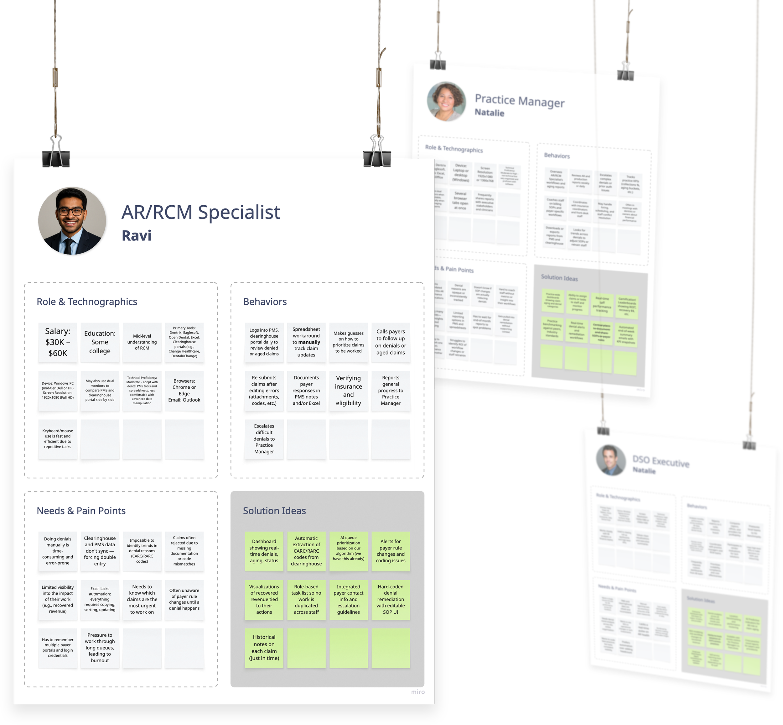
Proto-Personas (Archetypes)
I don’t think of personas as a once-and-done research deliverable. Rather I see them as living documents to be regarded as assumptions until validated by real users. I leave out the superfluous and focus primarily on their behaviors and the pain points they face as they try to achieve their goals. I also tend to include some details around technographics, education, and salary band, i.e. how they relate to technology and to their work.
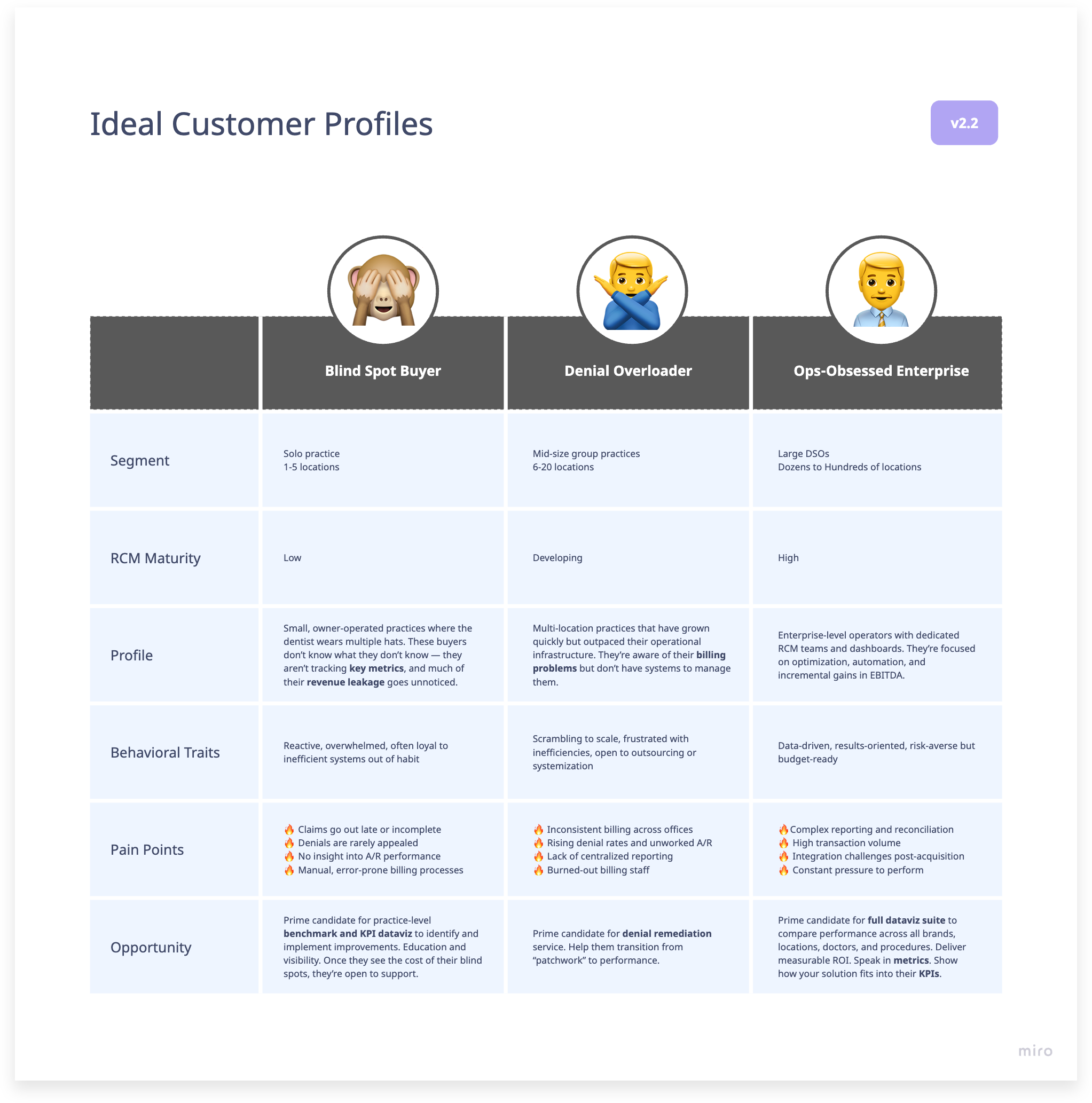
Ideal Customer Profiles (ICPs)
I led a research effort to size up the market with respect to varying organization sizes and their respective business pain points to help guide product positioning, feature prioritization, and go-to-market strategy.
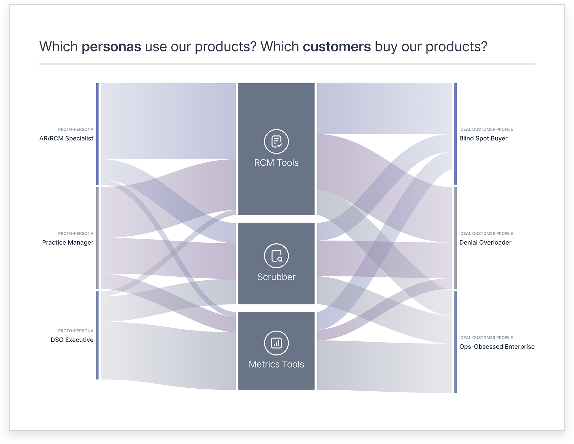
Alluvial chart depicting how our products relate to users and to customers
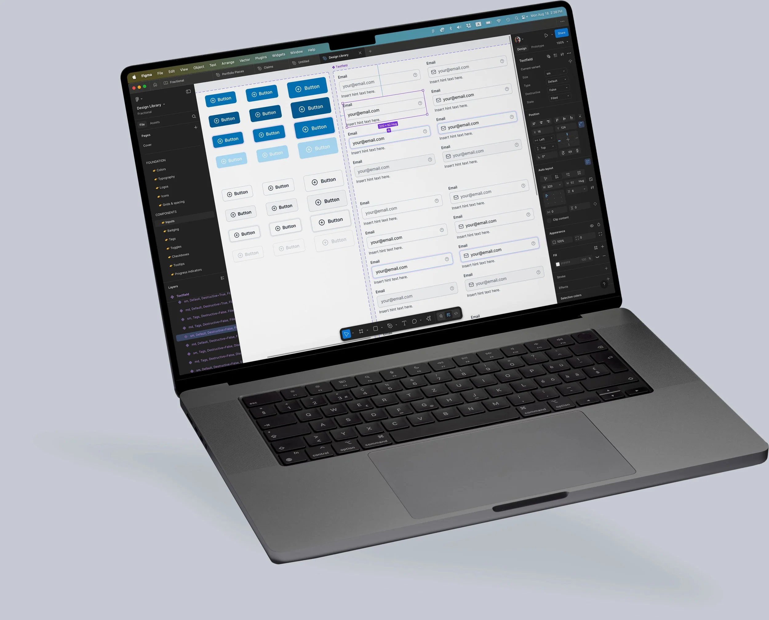
Design System & Component Library
In a scrappy, budget-conscious startup a lot of decisions are based on how you can accelerate design and dev cycles. This starts with a reliable component library. My dev team expressed a strong preference to build with MUI components, so that’s what we did.
Even if your application has the look and feel of every other application at first, you must remember you’re building toward workflow experience outcomes, not necessarily branding consistency, and definitely not precious unique snowflake design.
So you build as you go…
The design system was not built all at once. I added styles, components, and design patterns as needed. Occasionally, whenever I had a chance to catch my breath, I would spend a few design cycles refining the styles for typographic standards, color palette, and not least of all the standards for our data visualizations.
By and by we came to a place where our entire application suite felt like a wholly branded experience.

If you're not embarrassed by the first version of your product, you've launched too late.
Reid Hoffman
Co-founder of LinkedIn
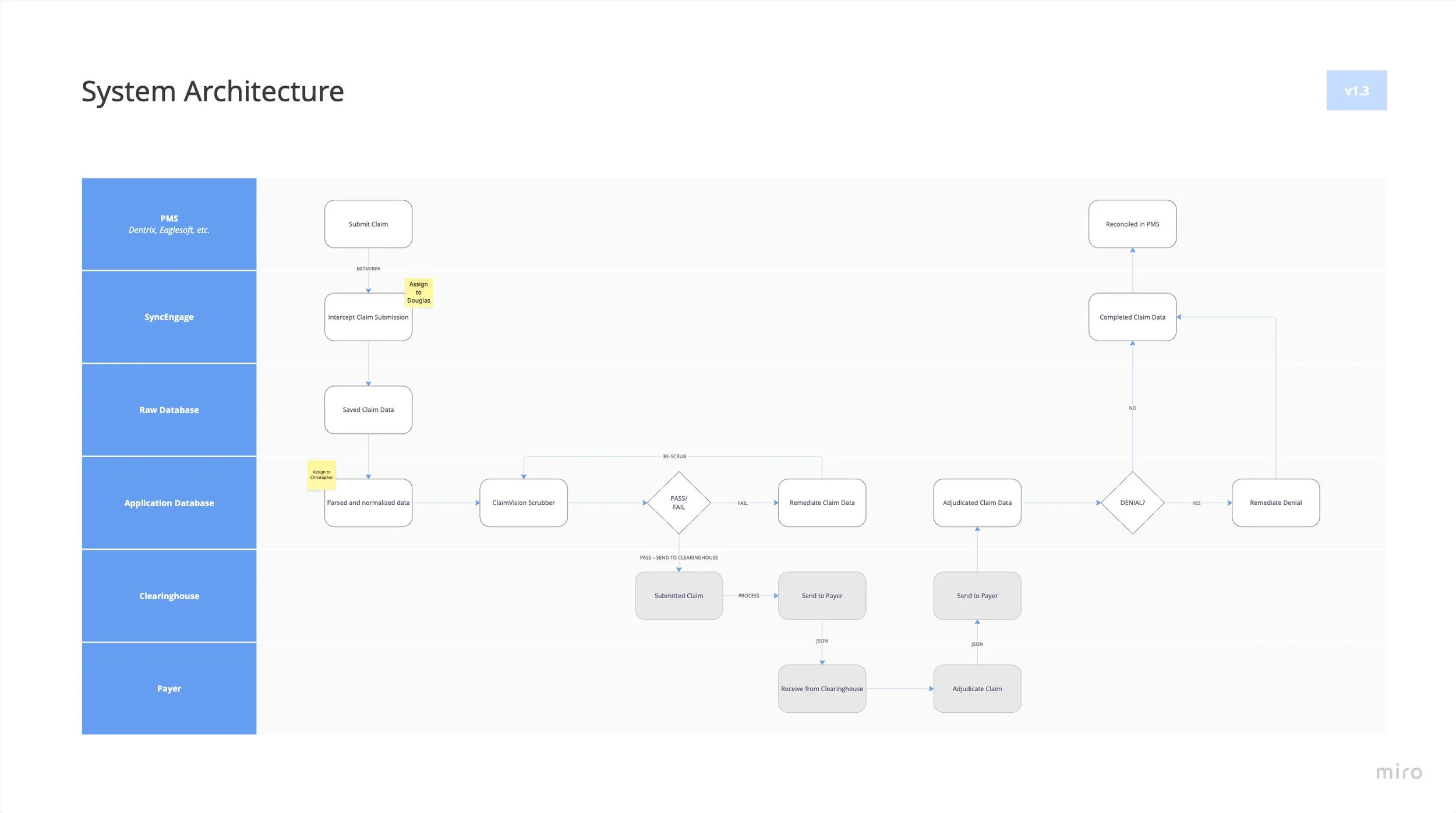
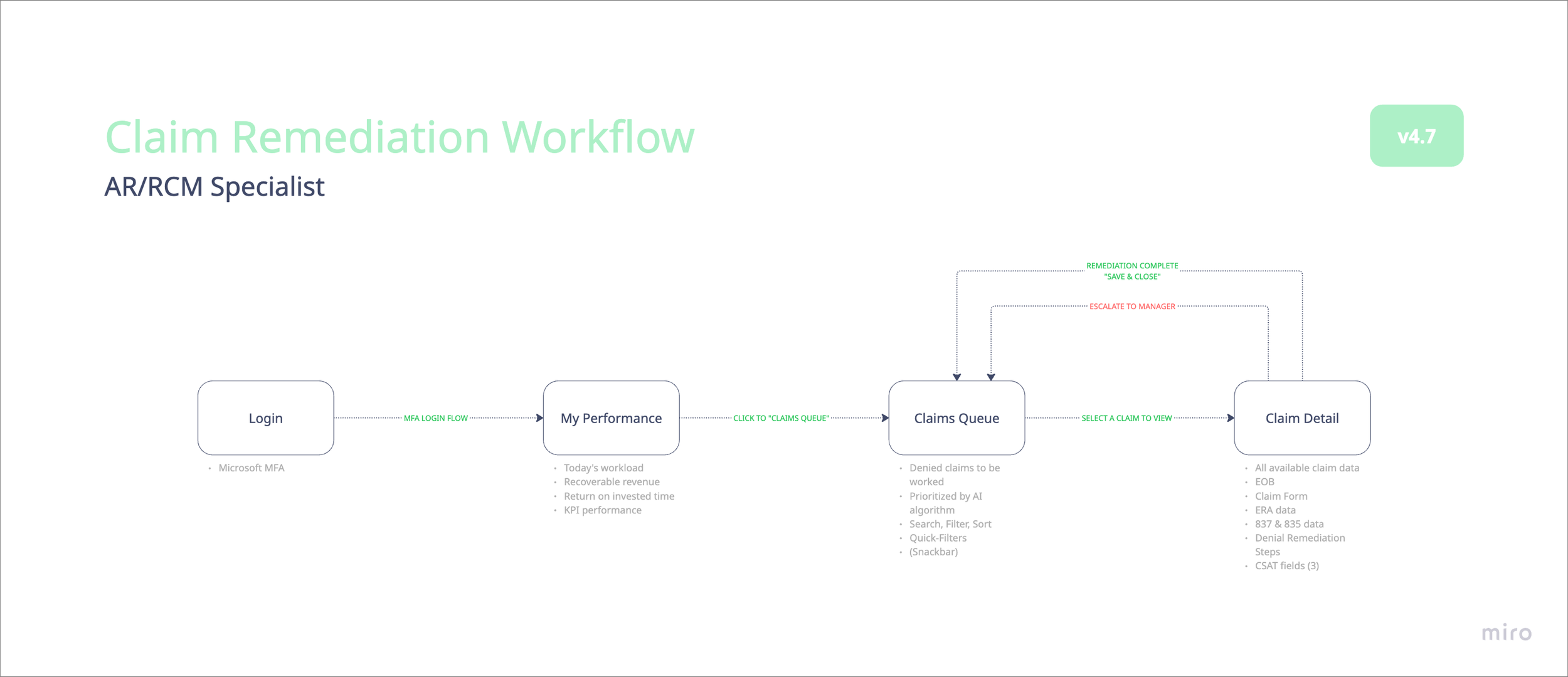
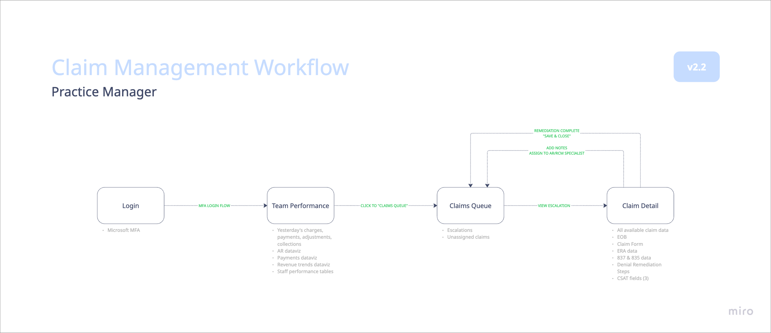
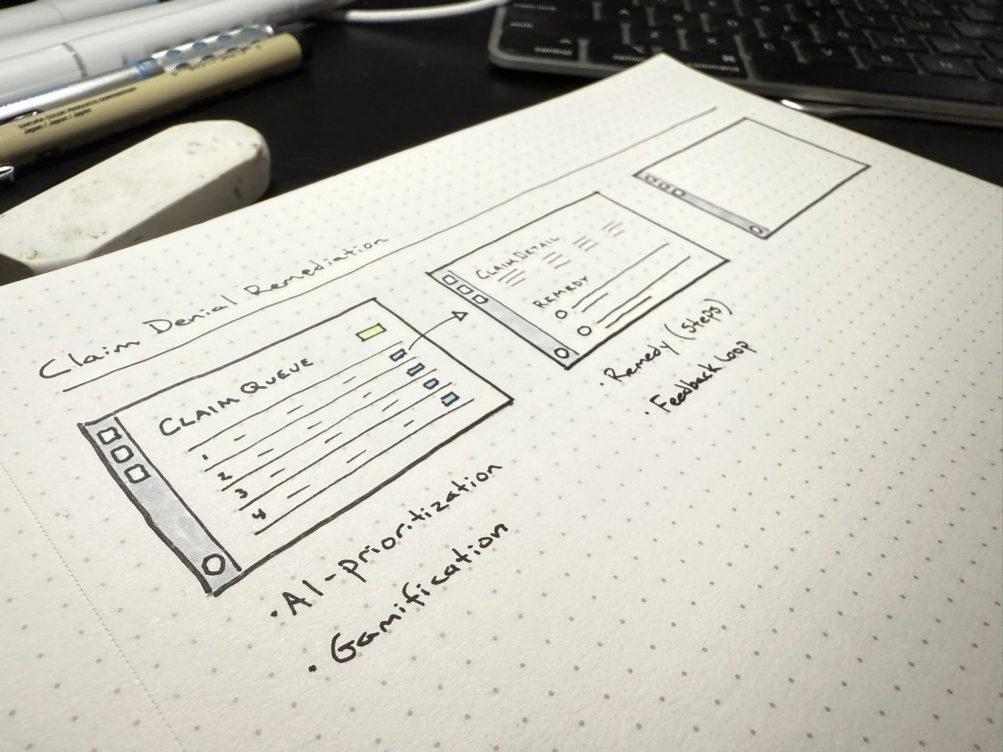
Workflow diagrams
With each new workflow or feature, I’d work in Miro creating visual product artifacts both as a reference and also a tool for knowledge transfer.
It’s important that all members of a product team – business stakeholders, product owners, UX researchers and designers, front- and back-end developers, and data engineers – share an understanding of how their work impacts the user experience. I don’t think I’m on a high horse here. The term “Product IQ” has different definitions depending who you ask, but when I say it, this is what I’m talking about. End of the day, all of these roles have an impact on the experience of the end user, and so these diagrams help us all to do our work with intention.
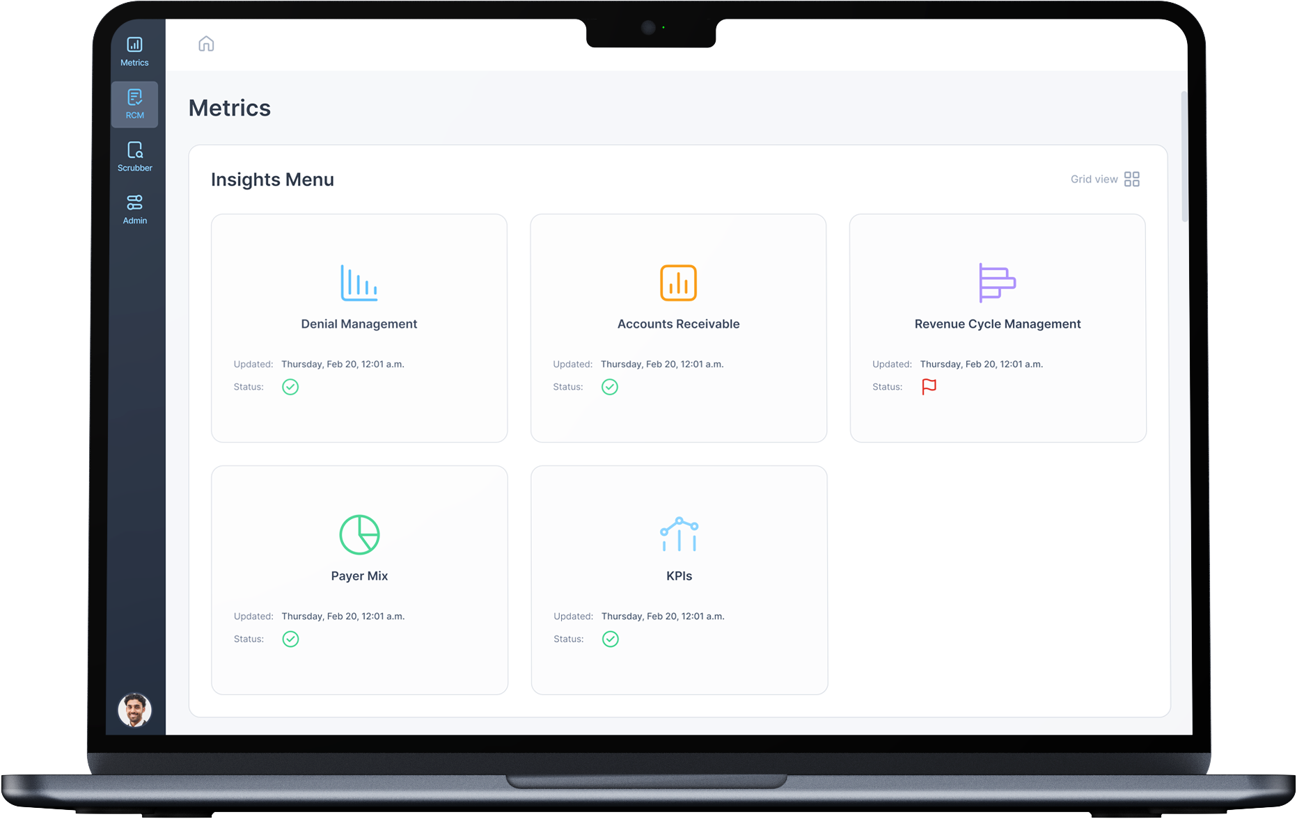
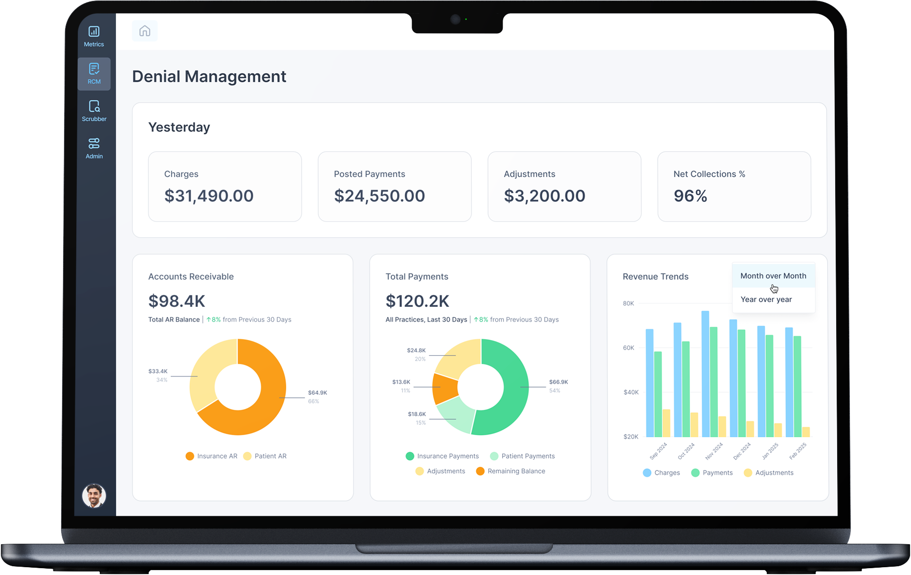
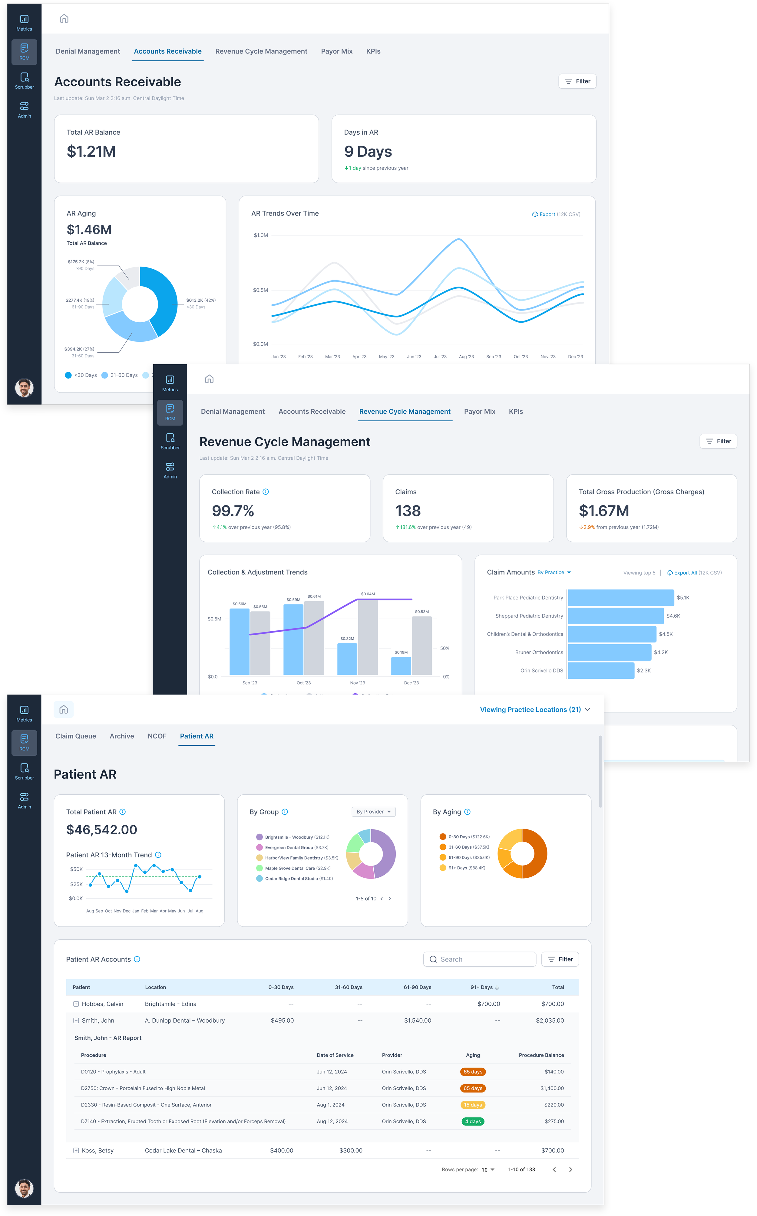
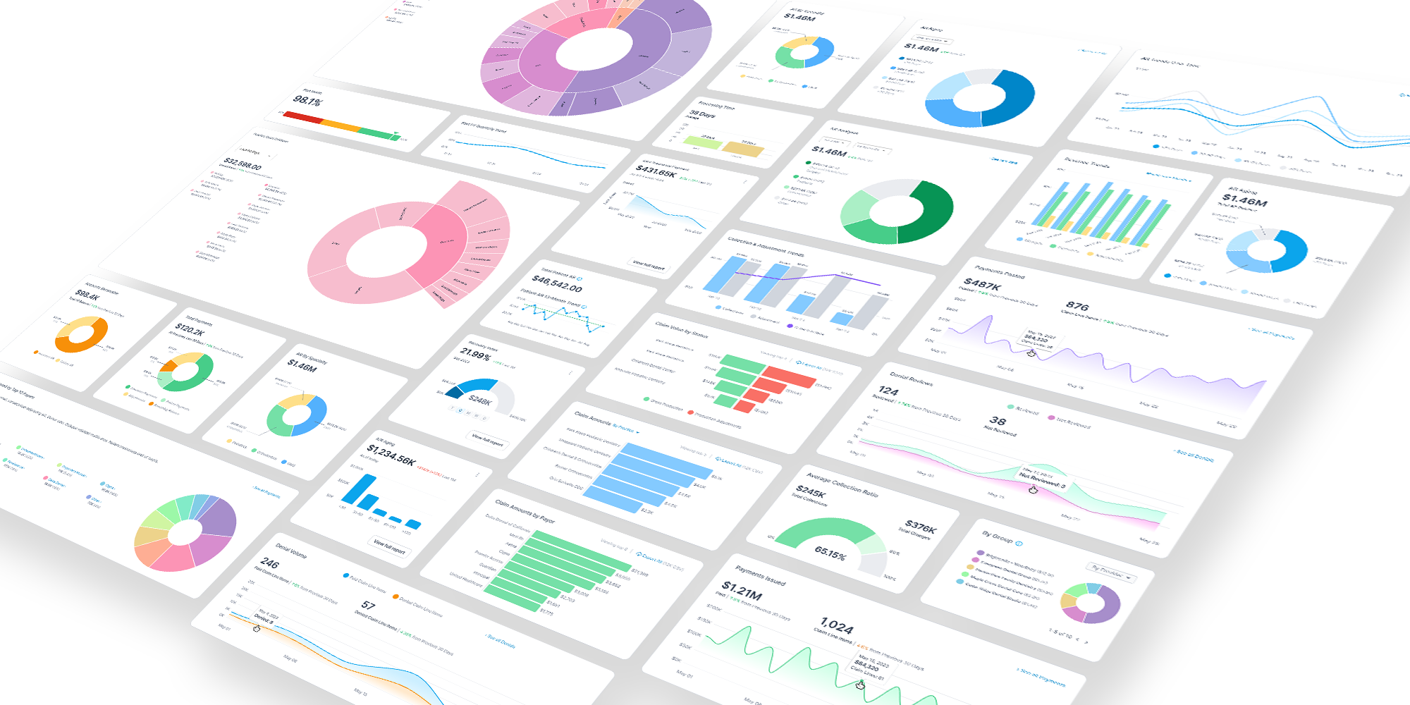
Dataviz
Data visualizations had not been my historical strong suite. But I met some very smart people on this project – folks who could perform complex feature engineering on gigabyte-sized datasets, wash it through filters and AI-driven logic, and bring it up in a PowerBI visualization. I learned a lot from them.
Thus fortified by a deeper understanding of what the data portends, I was able to create dataviz workflows enabling users to drill down through data layers (DSO, practice, location, doctor, procedure) while keeping them oriented.
I even learned to mess around with Python scripting so I could create rapid code-driven visualizations using D3.
I can’t remember when I ever learned so much in such a short amount of time.
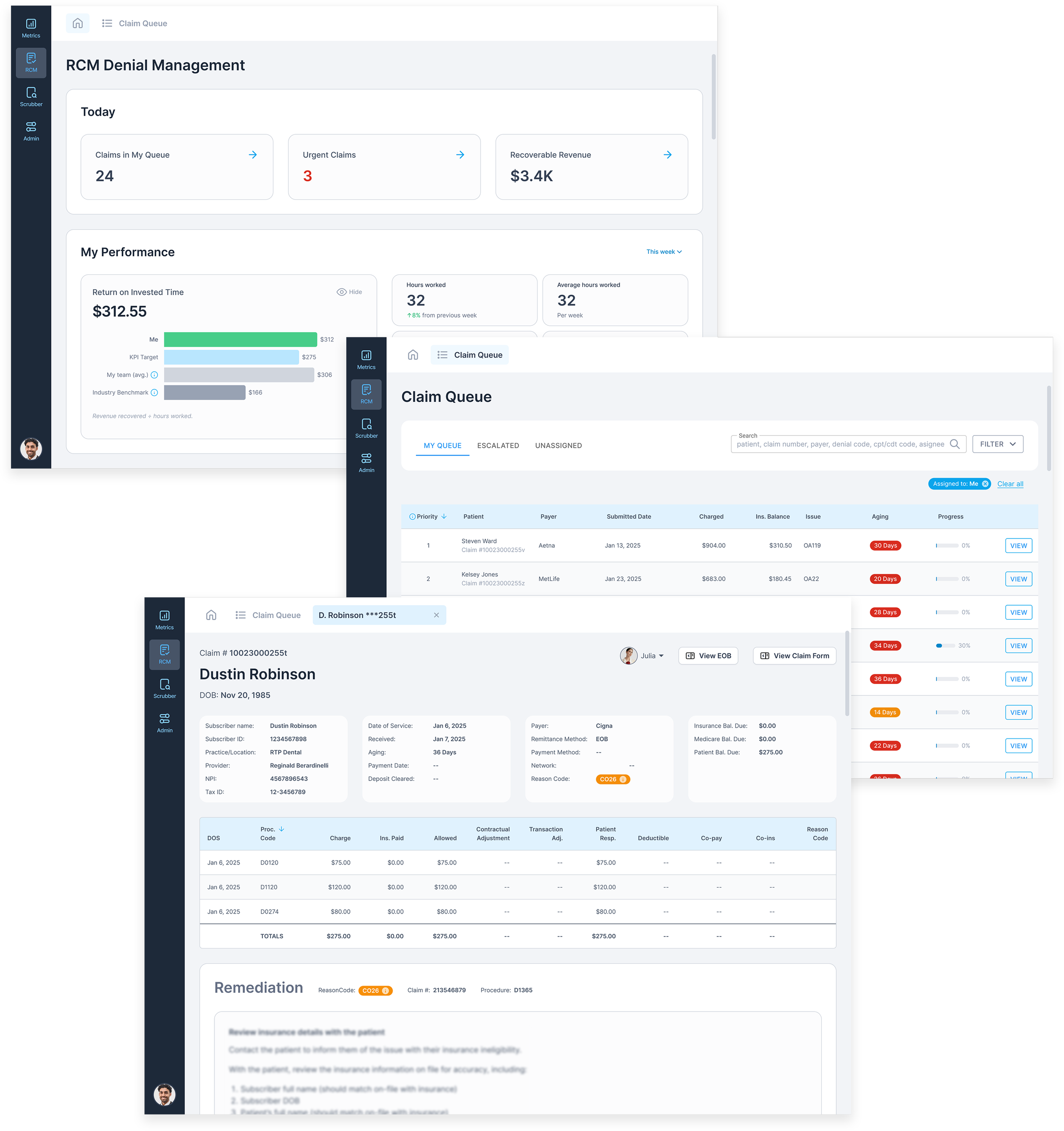
Claim Remediation Outcomes
One of the key value propositions of our platform was providing dental practices with the ability to empower entry level staff – with virtually zero knowledge of Revenue Cycle Management practices – to remediate denied claims and recover revenue which would have otherwise been written off.
For even a smaller practice, this could mean hundreds of thousands of dollars per year – and millions of dollars for large practices and DSOs.
Visibility of System Status
It’s heuristic #1 for a reason, and it’s something I maintain a constant awareness of, particularly when creating data-heavy UI within complex workflows.
For any particular screen in any given state, I ask myself, “What if the user came back from lunch to this exact screen and state? Could they easily and confidently resume their task?”
“You know you guys can charge whatever you want for this. Doesn’t matter what it costs. This app is gold!”
– An actual customer
My work is as much heart as it is brain. It’s empathy + data.
– Patrick Kuntz